As A Mass Communications major, we are taught a wide arrange of skills in the journalism school. Since it is a new major, I got to choose what electives I wanted to take. I believe being a jack of all trades has its benefits so I decided to take some visual communication design classes. Journalism 203 is Principles of Journalism and everything we learned revolved around the major design element principles for print and onscreen content such as unity, harmony, contrast, balance, proportion, center of visual interest and rhythm. For example, if a layout is not balanced and features eight different fonts then it is said to lack harmony and unity and causes the audience to feel distressed or confused, which no brand wants. Using these major principles in design is how to manipulate how the viewers see the brand’s identity, reputation and influences their behaviors.
The second class in the visual communication series was Journalism 346 and it taught me how to put these elements into creative content. After the semester ended, we had ten portfolio-worthy assignments. The first project made the greatest impact on me. The assignment was to create a company and to make mockups of potential brand logos. Professor Haun said to create a company that fed off of our passions. That is where I came up with the company, Music Mad, a music record label. From there, we had to sketch 20 potential logos. This was all about making something from nothing and it took a lot of creative thought all while applying the principles. I wanted the brand to be semi-chaotic because the music label is not supposed to be laid back or passive so I wanted to utilize contrast, balance and central figure. I wanted the contrast to be dark to show the depth of the recordings the brand would put out and the balance to be simple so the focus is more on the central logo.
The principle of visual interest is easy to apply to brand logos since you know when people look at logos they look directly at the center meaning to place them in the middle. The hardest principle was creating balance. Balance is hard to put into creative works because we all have a different eye for things like fonts, shapes or equal margins. For example, I am not a fan of cursive fonts but others may prefer them. So that made me realize I had to balance what kind of content was placed in these designs so I could balance all perspectives.
When I first started my internship with Intellectual Capitol they said their goal for the duration of my position was to create a newsletter. The word “create” always sparks something in me. I sketched and drew out potential layouts and spent days on creating the content for the first newsletter. For this project, I mainly utilized the elements of contrast, harmony, and balance. The design element principle of contrast was important to show where sections were divided such as article headlines and their bodies. This meant I would have to focus on darkening and lightening areas to show progression. Harmony is important when it comes to long body of texts, often seen in newsletters, so I had to use the same fonts consistently or at least making them look cohesive as to not distract the audience. Since emailing on phones is wildly popular, I had to worry about proportions to manage the balance. I learned minor coding to visually effect how mobile layout would differ from web layout since the phone is much smaller.
These monthly newsletters get over 1,000 views from the contact list. After the first one went out in May, Intellectual Capitol received many “great content” and “congratulations!” emails from contacts. Creating new things from scratch is a fun and creative process but requires much thought. Receiving these accolades verified my success with the formatting and design.
ARTIFACTS.
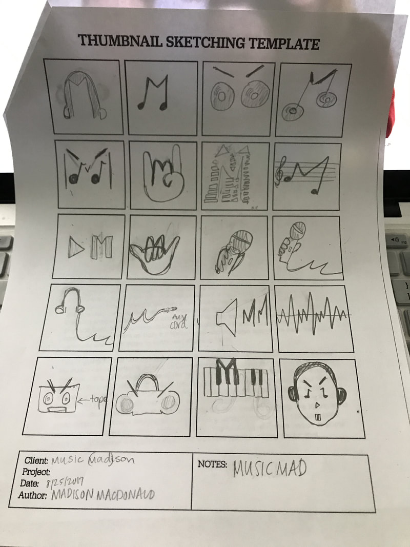
This was my sketch examples of possible brand logos for my brand "Music Mad" in Journalism 346.
To the right is the brand extensions and motifs after the logo was designed and expanded.
|
Music Mad Brand by Madison MacDonald on Scribd |
Below is the Newsletter layout for Intellectual Capitol that I designed from scratch. This example was sent out to over a thousand contacts in October.
|


|
